Freedive Reef
Landyachtz team riders Clayton Arthurs and Matt Noseworthy collaborated with Head of Product Nick Breton to build a freeride skateboard that would allow them to explore the steep roads and verdant neighborhoods of West Vancouver, BC. Our job was to make the board look as amazing as it would perform and to get people excited with feature content in Landyachtz Magazine.


The Story Defines the Look
The Freedive Reef is made by hand in our micro-factory, located in Kimberley, BC. The deck combines thin sheets of maple with stiff fiber glass, providing a light and rigid platform, ideal for downhill performance. We design the look of the board to highlight the quality of materials and construction, inviting the user to have a deeper look at the decisions that define the product. From the pattern of machined lines in the wheel wells to the color of our components, each detail is carefully considered both on their own and as a part of the complete story that we want to tell our customers.
Graphic Thoughts
We reached out to artist Nick Leifhebber about using his work as a graphic for the Freedive. His colorful screen prints look like layers of paper, cut with scissors. The arts and crafts aesthetic was a nice match for our handmade boards. We selected a beautiful piece that reminded us of a coral reef. We were also excited about areas of pure white, which have unique implications with sublimated graphics.


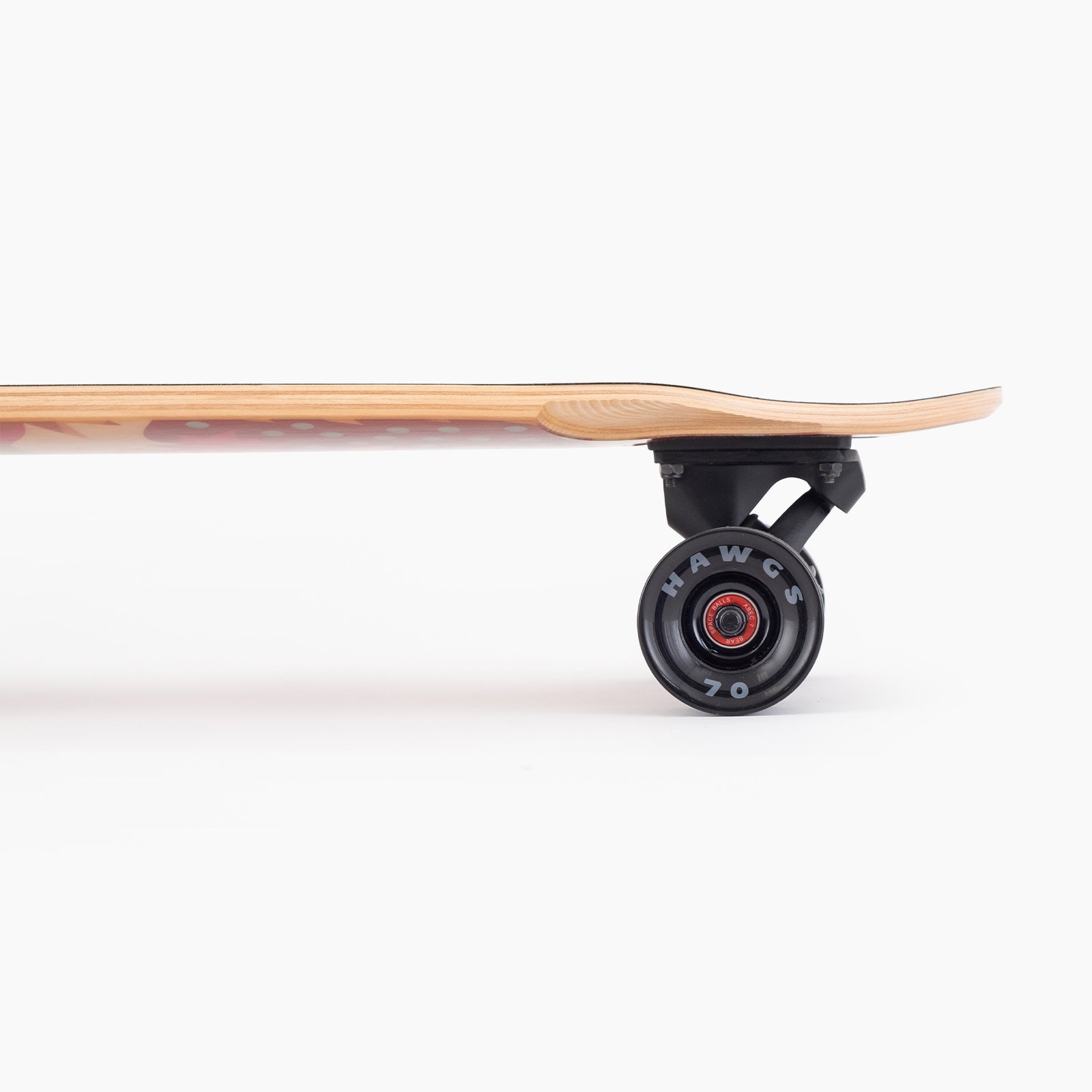
Sublimation Theory
Boards that feature top or bottom fiberglass sheets give us the opportunity for sublimated graphics. The process involves impregnating the fiberglass with high temperature gaseous ink that solidifies inside the material when it cools down. The result is a highly durable graphic with a few distinct characteristics, most notably the absence of white pigment. All colors will appear translucent in a sublimated graphic, black being the most opaque and white appearing completely transparent. This created an opportunity for us to use the white areas of the graphic as negative space, creating a window for the fiberglass texture and the wood grain to be seen. This results in the construction of the product becoming part of the context of the graphic. This is a skateboard first.
Performance and Style
The Freedive board came together with all black components and wheels, the perfect match for the mellow shades of the sublimated graphic. The wood grain and fiberglass textures come through, further highlighting the quality of materials and thoughtful design.
Magazine Feature
Once the board slated for production, it was time to start creating promotional material. We produce an annual magazine that combines product marketing with adventure travel and skateboard culture. Long format articles are a great opportunity for us to provide a deeper look at why we do what we do. For this article, we asked team rider Dexter Manning to interview his long-time friend and co-designer of the Freedive, Clayton Arthurs, to learn more about why the Freedive was created, who it’s for, and what it’s capable of doing.


Thanks!
I appreciate you taking the time to look at my portfolio! If you have any comments, criticisms, or ideas on how to improve this material, I would love to hear from you.